Nukleotidende have won a number of awards at Gullblekka (the Golden Notebook awards), the prize ceremony for student association editorial teams at NTNU. Below is an overview of all the awards our student magazine has received since the first Gulblekka in 2014 (for unknown reasons, we did not participate in Gullblekka 2018 - 2021). Note that the year listed refers to the year the article that won the award was published.

The Golden Notebook awards
2024 🥇🥇🥈🥈
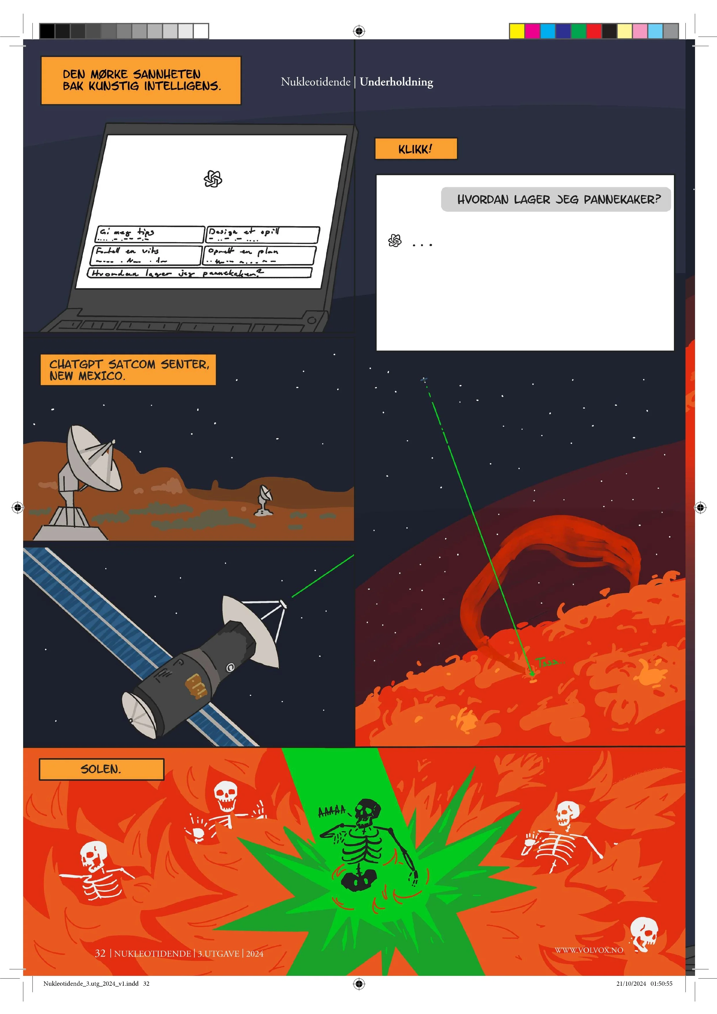
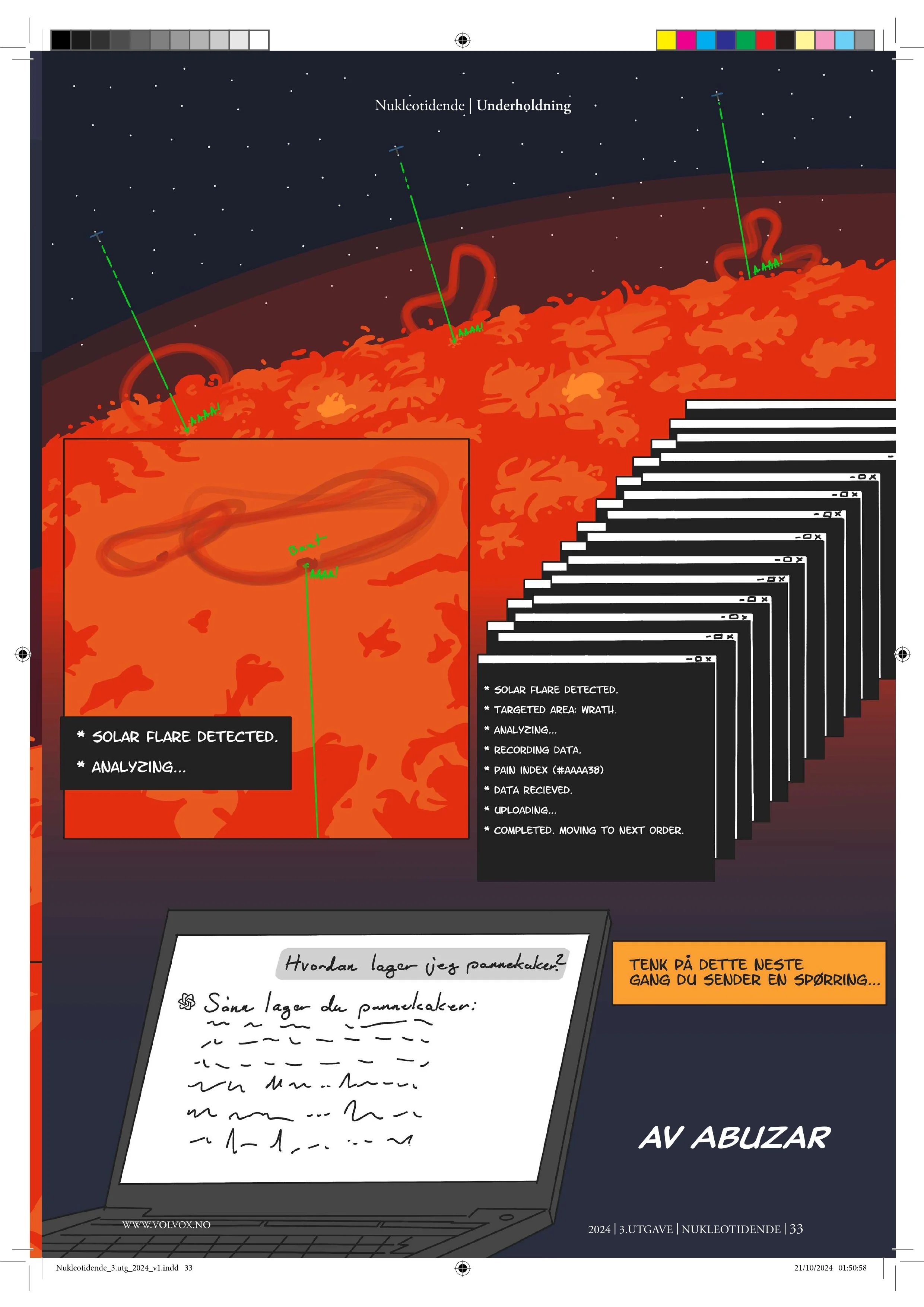
At Gullblekka 2025, Abuzar Abaev won 1st place for illustration of the Year with the illustration The Truth Behind Artificial Intelligence from issue 3, 2024.
Jury’s statement:
This year’s illustration offers an absurd, humorous, and inventive angle on a highly relevant topic. With clean style and strong technical skill, it brings something fresh and remarkable to the magazine, serving as an important and refreshing pause between the texts. The illustration is detail-rich, communicative, and unique, and is therefore well deserving of first place this year.
At Gullblekka 2025, Sivert Olai Sørøy Johansen won 1st place for Design of the Year for a Single Piece with the article Nukleotidende test Chemical Witches Brews from issue 3, 2024.
Jury’s statement:
This column has a creative design with a well-executed use of humor in interplay with both text and layout.
At Gullblekka 2025, August Larem Svare won 2nd place for Designer of the Year with the articles Førsteamanuensis framfor forhør Odd Reidar Gautun from issue 1, 2024, Hull I Hode: utgavens organisme og forbindelse from issue 3, 2024 and Autisten og Panna from issue 3, 2024.
At Gullblekka 2025 Abuzar Abaev won 2nd place for Cover of the year with the cover image from issue 2, 2024.

2023 🥇🥇🥇
At Gullblekka 2024, Kristine Marie Halvorsen won 1st place for Photo of the Year with the Centerfold Image from issue 1, 2023.
Jury’s statement:
There is a lot of skin in student association magazines, but it is rare to see it presented with such consistent photographic technique, composition and balance, and not least such creatice use of objects to conceal the more delicate parts. The framing and cropping are spot on, and the color palette works beautifully: the contrast between warm skin tones and the cold winter by Nidelva, with the red houses symmetrically set against the white and the blue.
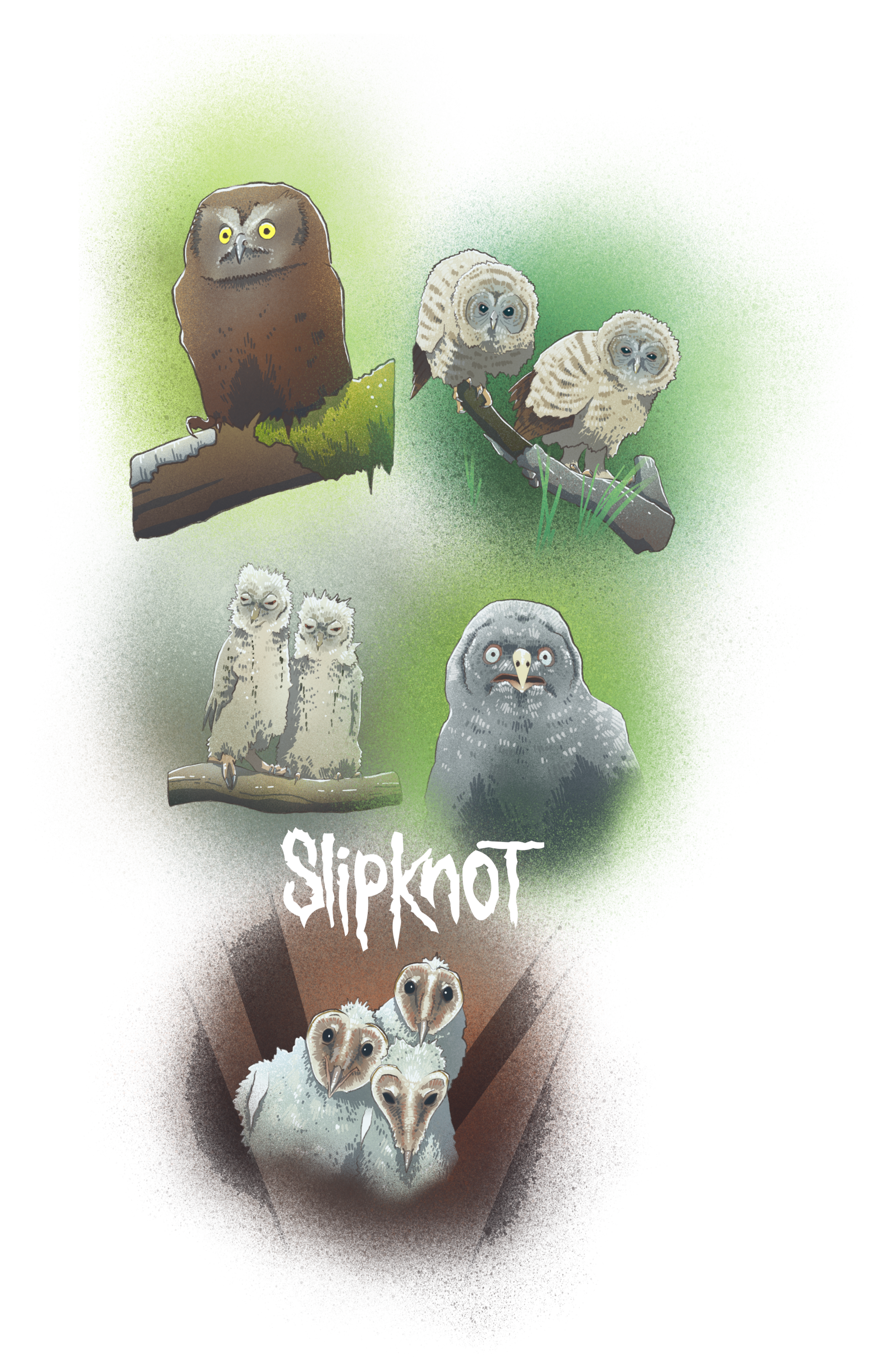
At Gullblekka 2024, Petter Nordenhaug won 1st place for Illustration of the Year with the illustration Petters Schmæckadoodles: Ugleunger from issue 2, 2023.
Jury’s statement:
The best illustration displays a distinct personality, both from the illustrator and in each individual motif. Exceptional technique and linework define an entire series of beautiful and detailed illustrations. Even though this category had many strong contenders, very few will object to this choice.
At Gullblekka 2024, Axel Brundell, Jens Cranner Dahle, Gulbrand Alme and Victor Van Nesmoen won 1st place for Open Category with the article Under Busken from issue 4, 2023.
Jury’s statement:
A good parody of recognizable student icons in Trondheim is at the core of what student association magazines aim to do. The creators describing themselves as David in the fight against Goliath is therefore fitting. As is well known, David struck the Philistine Goliath in the head with a stone before cutting off his head. Whether this can be considered an equally brutal takedown of Trondheim’s student newspaper is up to the reader, but there is no doubt that Under Busken hits the mark with its parody.


2022 🥈🥈
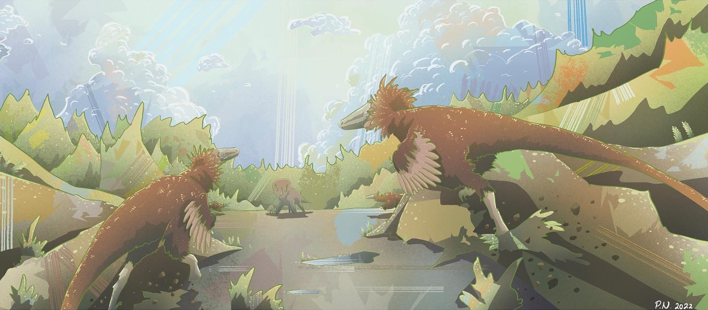
At Gullblekka 2023, Petter Nordenhaug won 2nd place for Illustration of the Year with the illustration Petters Schmæckadoodles from issue 2, 2022.
At Gullblekka 2023 Eliah Hudgins (photographer) won 2nd place for Picture of the Year with the Centerfold Image from issue 2, 2022.
2016 🥇
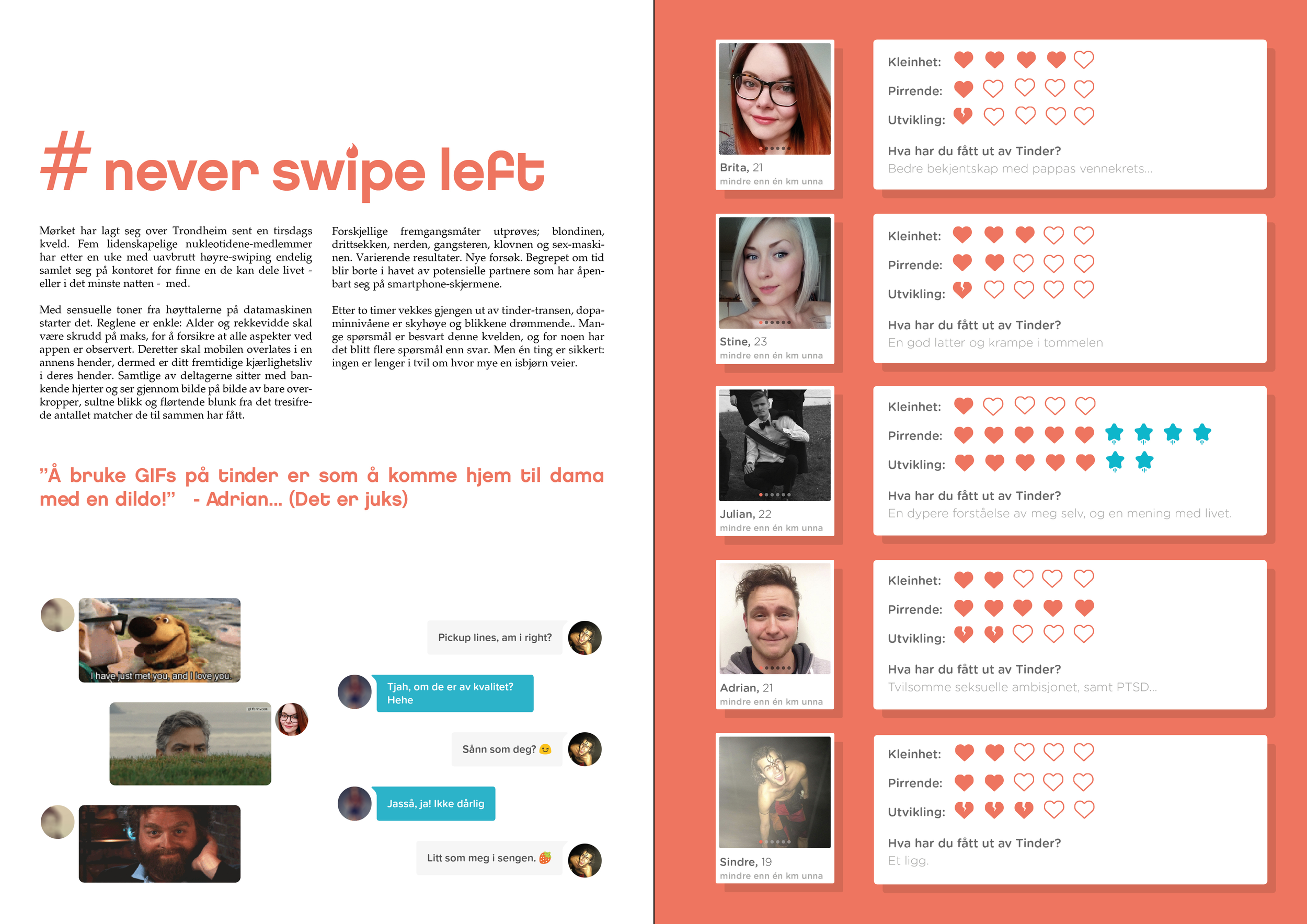
At Gullblekka 2017 Brita Andrea Randa Jerijärvi won 1st place for Design of the Year for a Single Pice with the article #never swipe left from issue 1, 2016.
Jury’s statement:
Activates many in the title with hashtags and gifs. Consistent execution in text, imagery, and use of symbols. Color-wise nice. Text and images comment on the same theme, but in different ways. Shows an understanding of the medium.